Archive for March, 2010
A Question of User Interface Design
Posted by Chris in Music, Programming on 31 March, 2010
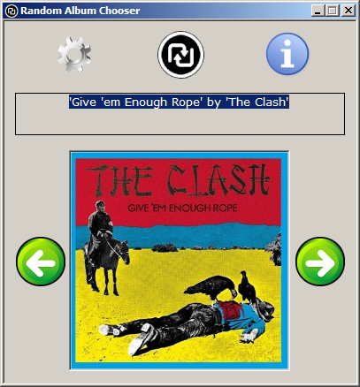
I’m doing some work on my album chooser application and feel that the user interface is too “clunky” in it’s current form:

Random album Chooser results
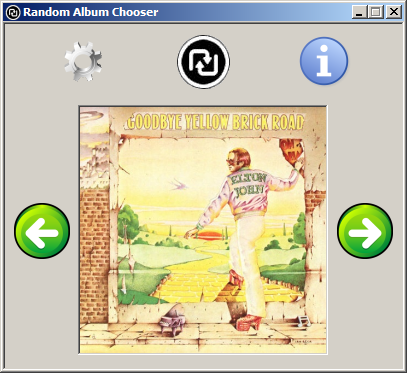
My first thought was to remove the text box displaying the album title and artist. After all this should be obvious from the image and just in case it isn’t I provide a tooltip. This results in the following interface:

First reworking of the user interface
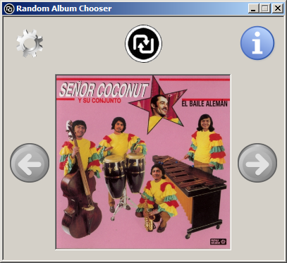
However, I’m still not happy with this. It looks “unbalanced” in some way that I can’t put my finger on. Equally aligning the Settings and Information icons with the navigation icons also looks unbalanced, because in this case the icons are too spaced out:

Second reworking of the user interface
Currently all of the icons are are the same size, which I think is the root cause of the problems. The question now becomes should I make the Settings, Information and Navigation icons smaller, or should I make the Choose icon larger?
I’ll continue experimenting and post more screen shots, but in the meantime any and all constructive comments are welcome.
© 2010, Chris. All rights reserved. If you republish this post can you please link back to the original post.